Branding & Web Design
Hey Remmy
A seed-stage GLP-1 brand came in with a name, a rough style guide, and a low-res logo they didn't love.
The Brief
A name. A category. A window.
Paid acquisition was being lined up. The brand needed to be ready. In a market full of clinical cold, the founders wanted something that felt like a friend — and gave me the creative latitude to figure out what that meant.
Discovery
Everyone looked the same.
Lively, Noom, Found, Hims, Ro — same pastels, same stock doctor shots. The opportunity was clear: warmth without softness.
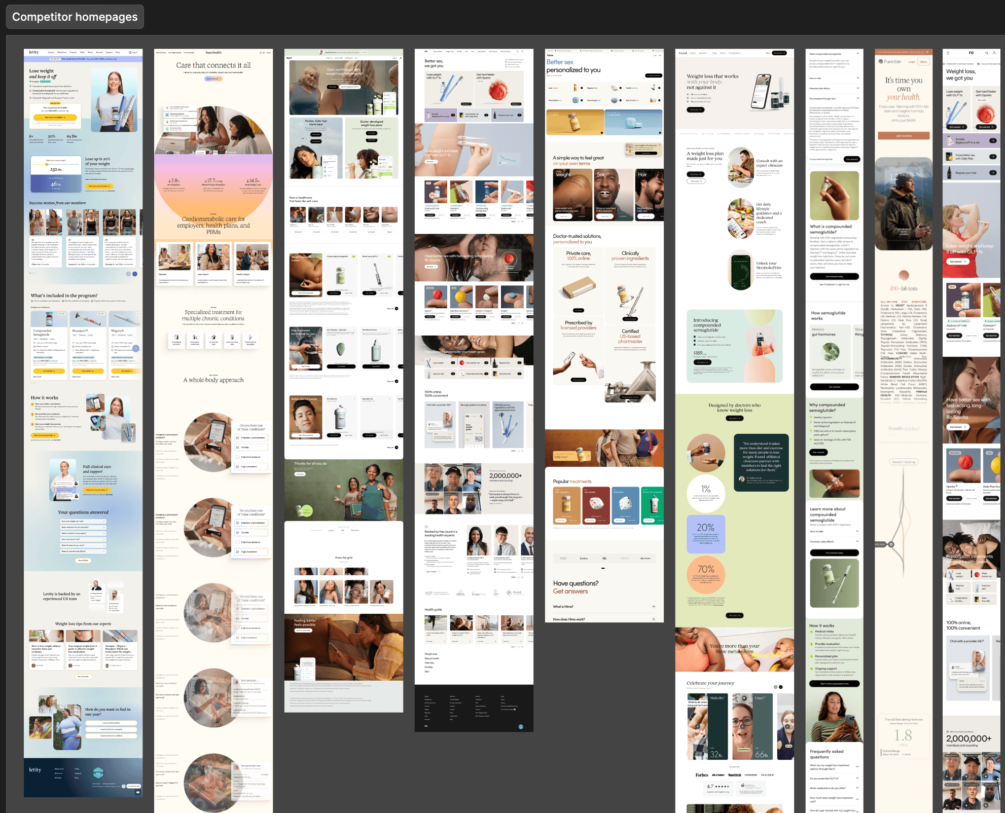
Competitive landscape — homepages mapped across the GLP-1 / telehealth category
Identity
Three marks, one voice.
Starting from their name alone, I built a full identity system — primary lockup, compact avatar mark, and a signature variant that signs off every touchpoint like a note from a friend.

Primary — Hey Remmy

Compact — Remmy

Signature — ♥ Remmy
Warm, not soft. Earthy, not clinical.
Deliberately different from the minty blues and lavenders crowding the category.
Brand color system
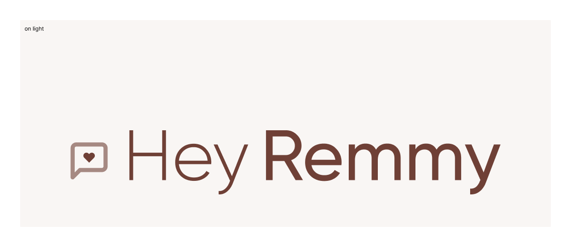
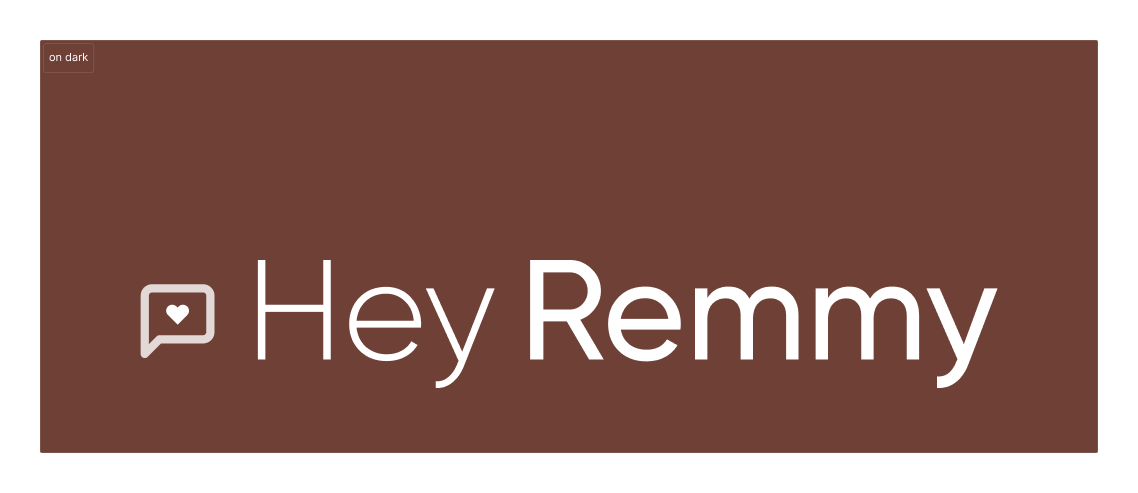
Logo on light and on-brand dark
Web Design
A homepage built for paid traffic.
One job: convert a skeptical, scroll-weary audience. Led with empathy over product — weight loss isn't a willpower problem, it's a biology problem.
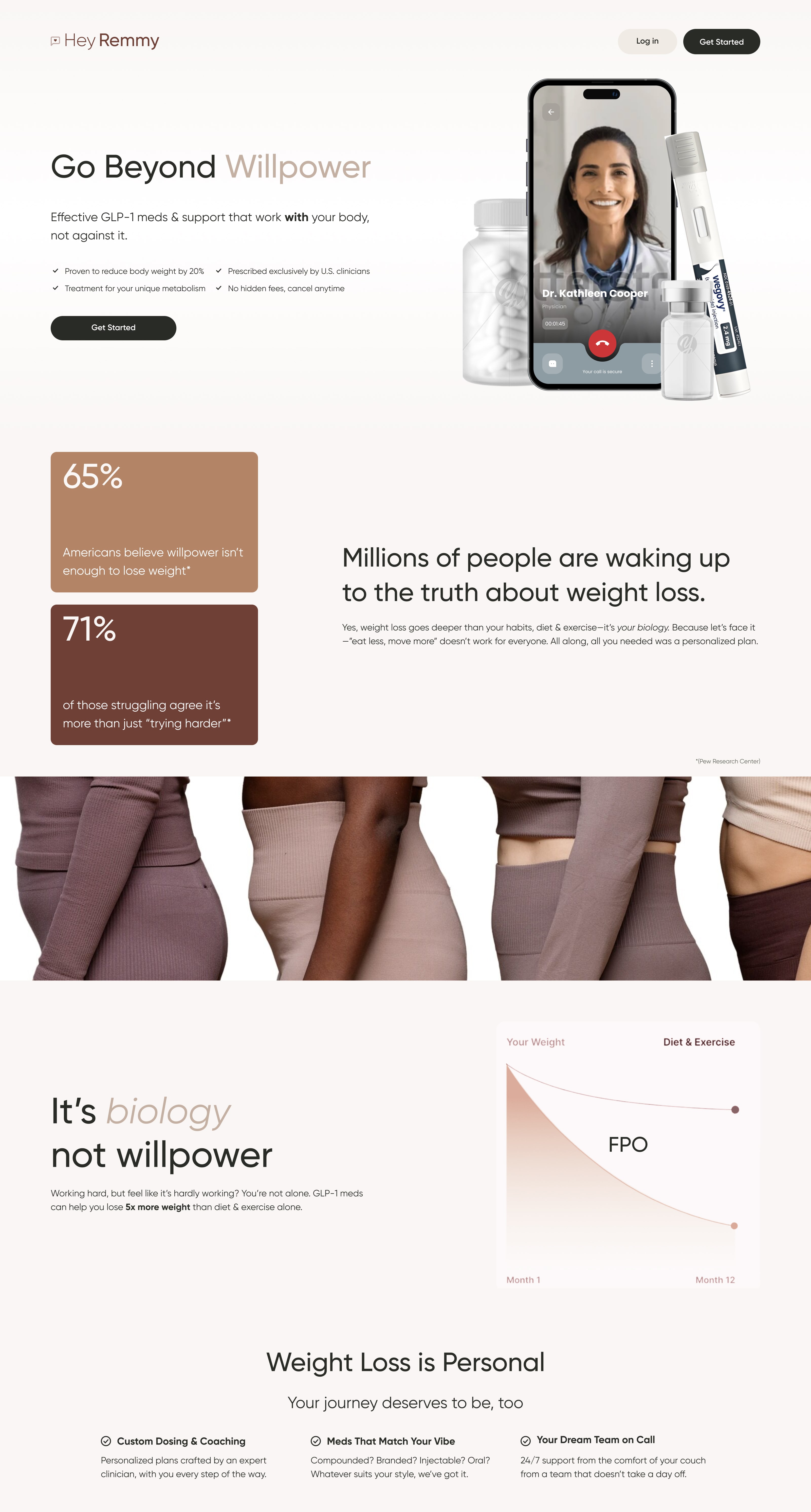

Homepage — desktop and mobile
Credits
Design Direction & Brand Strategy — Kenley Tiesmeyer · Copywriting — Monica Volk · Client — Hey Remmy